


Imagery
Real people, real learning — photography that tells the Lexonic story
Photography that empowers
Our imagery centres on real people in real learning environments. Every photograph should feel authentic, warm, and purposeful — never staged or stock-like.
We capture the energy of classrooms, the focus of learners, and the connection between educators and students. Our images should make people feel the impact of literacy.
Categories
Three types of photography serve different purposes across the brand.
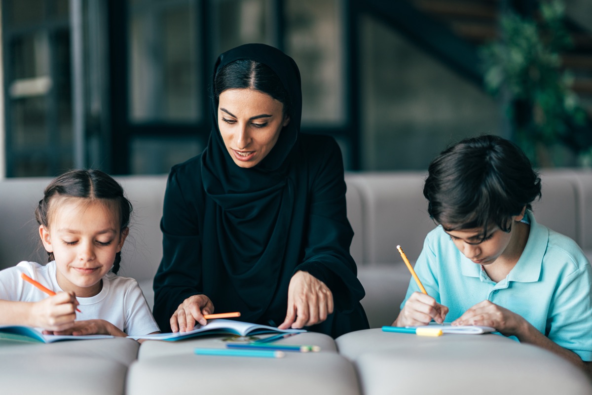
Learners
Students actively engaged with reading, writing, and learning. Show genuine concentration, joy of discovery, and diverse representation.
Educators
Teachers, trainers, and staff in professional development contexts. Capture collaboration, expertise, and the empowerment of training.
Environments
Classrooms, libraries, and learning spaces. Show the physical context where literacy transformation happens — bright, inclusive, and welcoming.
People first
Our most impactful imagery puts people at the centre — literally. Hero cutouts remove backgrounds to let subjects stand out against branded surfaces, surrounded by floating UI elements that tell their story.

From stock to Lexonic in four steps
 Before
 Choose your subject
Start with authentic photography of real people — learners, educators, or staff. Avoid overly polished stock that feels staged.
Process Remove the background
Isolate the subject with a clean cutout. The person becomes a standalone element that can live on any branded surface.
Process Place on branded surface
Set the cutout on a dark branded background with blurred colour blobs and decorative shapes. Add drop-shadow-2xl for depth.
Result Add context layers
Surround the subject with floating stat cards, evidence badges, and UI elements that tell their story. The person stays central.
Blending people into surfaces
The cutout subject shouldn't feel pasted on — they should feel part of the surface. We use layers of colour glows and blur to blend the person into the section naturally.
Background glows
Large, soft colour blobs in the section's brand colour at low opacity (10-40%). These create depth and warmth behind the subject.
Subject + bottom fade
Place the cutout with drop-shadow-2xl. Add a gradient fade at the bottom edge so the person grows out of the surface rather than sitting on it.
Decorative context
Add floating shapes, stat cards, and secondary blobs. These sit at varying z-levels — some behind, some in front — creating a layered, immersive composition.
The Lexonic rule: people are never decoration
Every person in our imagery has a purpose. They represent a learner whose life is changing, an educator being empowered, or a community being served. When we place someone at the centre of a composition, we're saying: this is who we do it for. The dark backgrounds, floating stats, and brand elements exist to amplify their story — never to overshadow it.
Image treatments
Photography is enhanced through brand-specific treatments that add depth and visual identity.
Rounded corners
All images use rounded-2xl (16px) or rounded-3xl (24px) corners. Never use sharp rectangular images.
Drop shadows
Use drop-shadow-2xl on hero cutouts and floating image elements. Creates depth and separates images from backgrounds.
Text over image Gradient overlays
Use gradient fades from dark to transparent when placing text over images. Always ensure sufficient contrast for readability.
Colour wash
A subtle brand colour overlay using mix-blend-multiply at low opacity (20-30%) unifies photography with the Lexonic palette.
Brand mask
The Lexonicon can be used as a mask to frame photography, creating a distinctive branded treatment that's instantly recognisable.
This technique works best with close-up portraits and candid shots where the subject fills the frame. The logo shape becomes a window into the human story.
Use on light or dark backgrounds
Choose photos where the subject is centred
Add a subtle drop shadow for depth on light backgrounds
Hexagon clip
Spiral mask
Lexonicon mask
Text meets image
Bold typography and photography work together. Here are our signature arrangements.
Every learner deserves a chance
27 months average reading age increase across all programmes.
Build confidence in every classroom
Programme duration that delivers life-changing results
Nobody should be limited because they can't read
Pairing imagery with colour
Each brand colour creates a different mood when paired with photography. Use the product colour to set the emotional tone of each section.
Trust & authority
Premium & expertise
Growth & progress
Energy & urgency
Depth & adaptability
Optimism & celebration
Guidelines
Do
- Use natural lighting and authentic classroom environments
- Show diverse learners of different ages, backgrounds, and abilities
- Capture genuine moments of engagement and discovery
- Always apply rounded corners and consider brand colour treatments
Don't
- Use generic stock photography with posed, artificial scenarios
- Apply heavy filters or over-saturated colour grading
- Use sharp rectangular images without rounded corners
- Show technology without human context — always include people